Final "Defending Big D" Logo Design
Defending Big D
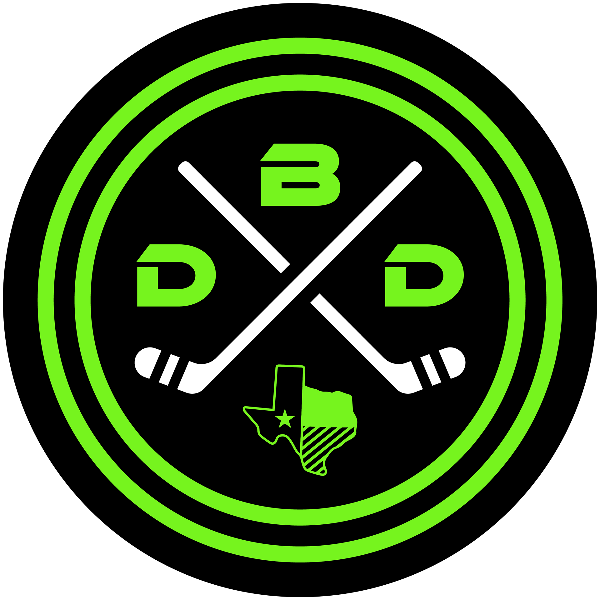
"Defending Big D" is a fan-driven site dedicated to coverage of the Dallas Stars hockey team. It provides in-depth analysis, game day previews, recaps, trade news, prospect updates, and podcast episodes, catering to fans who want comprehensive insights into the team’s performance, roster changes, and league standing. I was tasked with giving the old logo an upgraded fresh and modern take while capturing the energy of the Dallas Stars.
I was inspired by the Stars' "blackout" jerseys and wanted the logo to resonate with Texas hockey fans. To emphasize Texas pride, I incorporated the outline of Texas, cleverly shaping the top part as a hockey skate to blend the state’s identity with the spirit of the game.

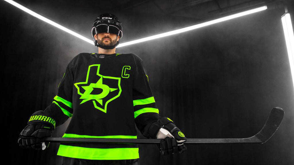
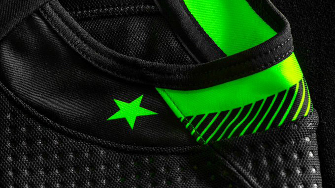
Hockey puck mockup and inspiration photos.



Other Logo Iterations.
SunCity Pickleball Club
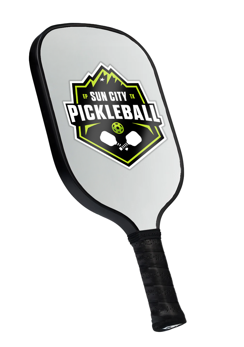
The "Sun City Pickleball" logo was created for a new, up-and-coming pickleball club in El Paso, Texas. I aimed to incorporate design elements that reflect the city's unique identity. The top features a stylized outline of the Franklin Mountains, complemented by a bold star, referencing the iconic star on the mountainside that symbolizes the city. The dynamic typography conveys the energy of the sport, while the inclusion of pickleball paddles and a ball highlights the game itself.
Mockups of Pickleball Paddles with "Sun City Pickleball" Logo.


Color Happy
When quarantine hobbies evolve into side hustles, Color Happy was born. This brand was created by a close friend of mine, and I had the privilege of branding and bringing her vision to life. Her shop offers a vibrant collection of beaded bracelets, filled with color, glitter, playful quirks, and a touch of classic nostalgia.
J.M. Hanks High School Orchestra
This logo, created during my high school years for the orchestra at J.M. Hanks High School in El Paso, TX, marks my first design project and holds personal significance as I was both an attendee and a member of the orchestra. Inspired by the school's knight mascot, I aimed to blend medieval elements with the elegance of musical instruments. The knight’s silhouette forms the inner curves of a violin, while a sword serves as the bridge and neck.
This design has since become a lasting symbol for the organization, used for all their fundraisers, t-shirts, and events, and continues to be in use today.